
Table of Contents
Understanding light color temperature isn’t just about picking the “brightest” bulb. It’s about choosing the right hue of light that fits the function of a space, supports human comfort, and elevates how environments look and feel. Whether you’re remodeling your home, upgrading LEDs, or troubleshooting lighting issues, this guide will walk you through everything you need to know — with expert tips you won’t find in a typical product description.
Let’s begin by solving the fundamental question: what exactly is light color temperature and how do you choose the right one for your needs?
What Is Light Color Temperature and Why It Matters
When people talk about lighting, they often jump straight to brightness. But in real-world applications, brightness alone doesn’t determine whether a space feels comfortable, functional, or visually appealing. Light color temperature plays an equally important — and often more influential — role in how we experience light on a daily basis.
Understanding this concept allows homeowners, designers, and facility managers to make smarter lighting decisions that directly impact mood, productivity, safety, and visual comfort.
What Is Light Color Temperature?
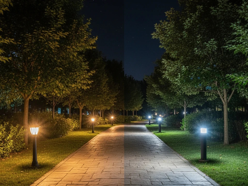
Light color temperature describes the appearance of the light itself, not how intense it is. It is measured in Kelvin (K) and indicates whether a light source looks warm (yellowish), neutral (white), or cool (bluish).
The scale works in a way that often surprises people:
- Lower Kelvin values produce warmer, more yellow light
- Higher Kelvin values produce cooler, more blue-white light
For example:
- 2700K color temperature = warm white, similar to traditional incandescent bulbs
- 3000K light color = warm white with slightly cleaner appearance
- 3500K color temperature = neutral warm white
- 4000K color temperature = neutral to cool white
- 5000K+ = daylight-like white or bluish white
This Kelvin system originates from physics: when an ideal black-body radiator is heated, it glows different colors at different temperatures. Lighting manufacturers use this same reference to classify light bulb color temperature.
In practical terms, light color temperature answers a simple question:
Does this light feel warm and cozy, balanced and natural, or crisp and cool?
Light Color Temperature vs. Brightness: A Common Confusion
One of the biggest misconceptions is assuming that higher Kelvin automatically means brighter light. In reality:
- Brightness is measured in lumens
- Light color temperature describes color appearance
A 2700K bulb and a 4000K bulb can both produce the same lumen output, yet look very different. The 4000K light may appear brighter because cooler light increases contrast and visual sharpness, but it is not necessarily producing more light.
This distinction matters when choosing led bulb color temperature. Many people try to solve poor visibility by switching to cooler light, when what they actually need is higher lumen output or better fixture placement.
Understanding this difference prevents over-lighting, glare issues, and unnecessary eye strain.
Why Light Color Temperature Matters More Than You Think
Light influences human perception in subtle but powerful ways. The color of light affects:
- Emotional response
- Alertness and focus
- Perceived room temperature
- Color accuracy
- Long-term visual comfort
In other words, light color temperature shapes how a space feels, not just how it looks.
- Psychological Impact
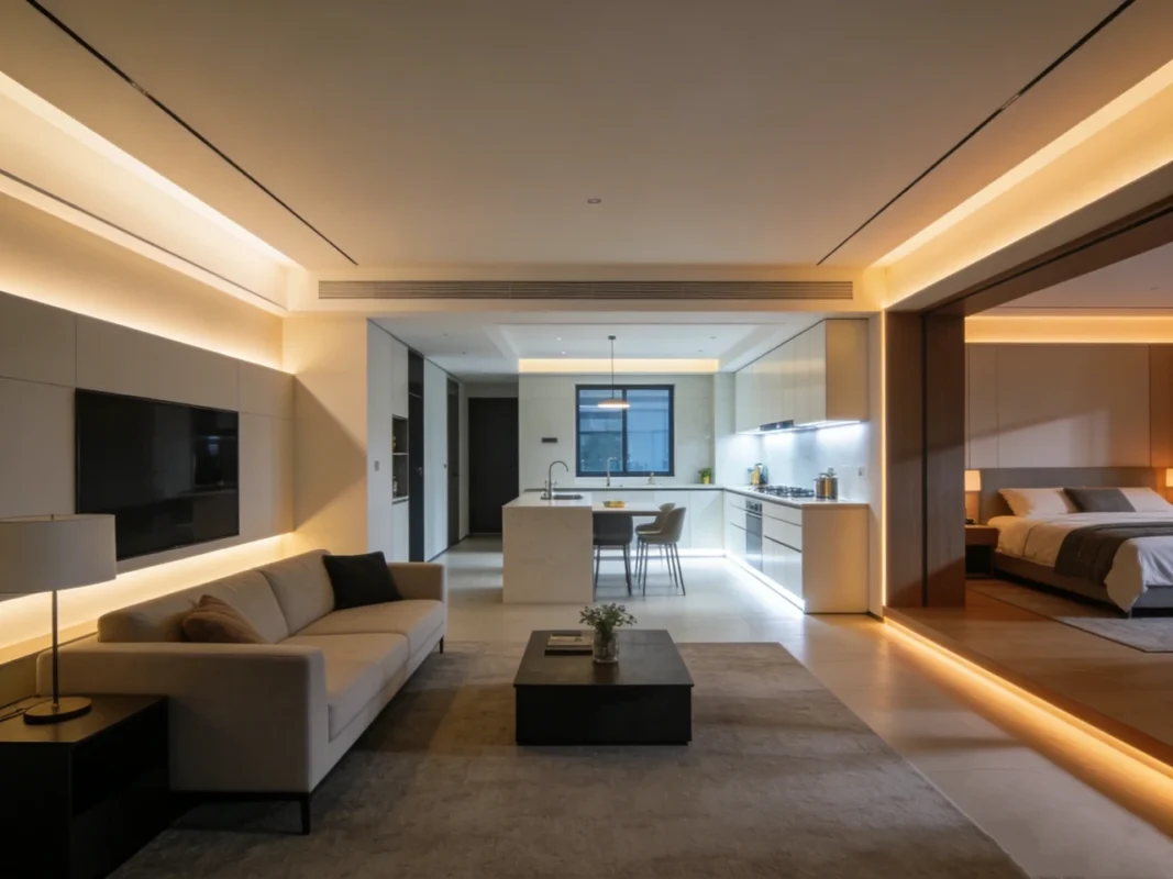
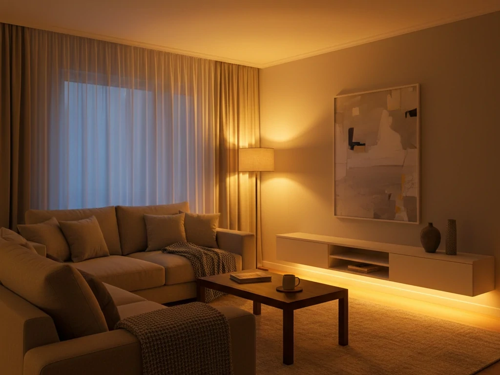
Warm light (such as 2700K and 3000K color temperature) tends to feel calming and intimate. It encourages relaxation and social interaction. That’s why it’s commonly used in living rooms, bedrooms, and dining areas.
Cooler light (such as 4000K color temperature) feels more energizing and alert. It supports concentration, making it well suited for kitchens, offices, workshops, and utility spaces.
This isn’t accidental. Human circadian rhythms are influenced by light color. Warmer tones signal evening and rest, while cooler tones resemble daylight and promote wakefulness.
- Visual Performance
Light color temperature directly affects how easily we can distinguish details.
- Warm light softens contrast and shadows
- Neutral light improves clarity
- Cool light increases perceived sharpness
For tasks like reading small print, cooking, or detailed work, a neutral range such as 3500K color temperature or 4000K color temperature often provides the best balance between comfort and visibility.
- Color Accuracy
Different light temperatures influence how colors appear on surfaces and objects. Warm light enhances reds, oranges, and wood tones. Cooler light emphasizes blues, whites, and grays.
This matters in spaces where accurate color perception is important, such as:
- Kitchens
- Bathrooms
- Retail displays
- Art studios
Choosing the wrong light bulb color temperature can make paint colors look off, food appear dull, or fabrics seem different from how they look in daylight.
How Light Color Temperature Shapes Room Perception
Light color temperature doesn’t just affect objects — it changes how we perceive space itself.
- Warm light makes rooms feel more intimate and smaller
- Neutral light feels balanced and open
- Cool light can make spaces feel larger and more clinical
For example, a small bedroom lit with 4000K color temperature may feel stark and uncomfortable, while the same room with 3000K light color feels softer and more welcoming.
Conversely, a garage or workspace lit with 2700K color temperature may feel dim and murky, even if brightness is adequate.
Choosing the correct light temperature prevents these common mismatches.
Why Modern LED Lighting Makes Color Temperature Even More Important
Traditional incandescent bulbs were almost always warm in tone. Today’s LED technology offers a huge range of led bulb color temperature options, from very warm to extremely cool.
This flexibility is a major advantage — but only if choices are made intentionally.
Two LED bulbs with identical wattage and lumens can look completely different depending on color temperature. That’s why understanding light color temperature is now a basic requirement for good lighting design, not a technical luxury.
Modern LED lighting also allows:
- Tunable white lighting (adjustable color temperature)
- Different temperatures in different rooms
- Layered lighting using multiple Kelvin values
Without a clear understanding of light temperature, it’s easy to create inconsistent or uncomfortable lighting environments.
Breaking Down Common Light Color Temperatures
Once you understand what light color temperature means and why it matters, the next step is knowing how specific Kelvin ranges behave in real spaces. Numbers alone don’t tell the whole story. What truly matters is how each range feels, how it performs, and where it makes the most sense to use.
Below, we break down the most commonly used light color temperature ranges in practical terms, based on real-world application, visual comfort, and functional performance.
2700K Color Temperature – Warm, Comfortable, and Familiar
2700K color temperature sits at the warm end of the spectrum and closely resembles traditional incandescent lighting. The light appears soft, golden, and slightly yellow.
This range is best described as cozy.
Where 2700K Works Best
- Bedrooms
- Living rooms
- Reading corners
- Dining rooms
- Hospitality-style spaces
Warm light encourages relaxation and creates a sense of emotional comfort. For this reason, 2700K color temperature is often chosen for spaces where people unwind or socialize.
Visual Characteristics
- Enhances warm colors like wood, leather, and earth tones
- Softens shadows
- Reduces visual harshness
Many people ask: Is 2700K too yellow?
The honest answer: it depends on context. Compared to neutral or cool light, yes, 2700K appears noticeably warmer. But that warmth is intentional. In residential environments, especially in the evening, this softer tone feels natural and calming.
When 2700K May Not Be Ideal
- Detailed task areas
- Kitchens with heavy food prep
- Workspaces requiring sharp visibility
In these environments, the warm tone can slightly reduce contrast and make fine details harder to see.
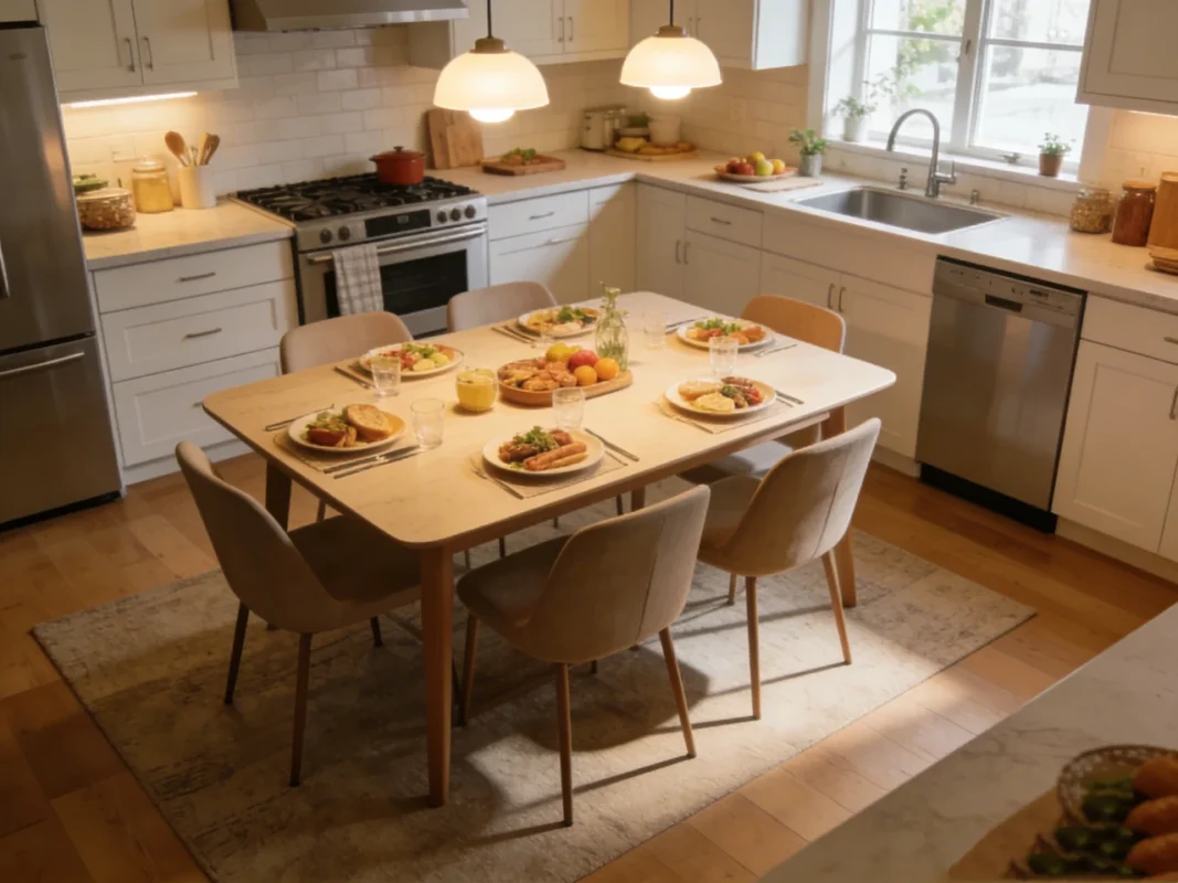
3000K Light Color – Warm but More Versatile
3000K light color remains warm, but with less yellow than 2700K. Many people consider this the most flexible warm-light option.
If 2700K feels too amber, 3000K color temperature is often the solution.
Where 3000K Color Temperature Excels
- Kitchens
- Bathrooms
- Hallways
- Living rooms
- Entryways
It maintains a comfortable feel while improving clarity compared to 2700K color temperature.
Visual Characteristics
- Warm white appearance
- Cleaner than 2700K
- Better contrast without feeling cool
In residential projects, 3000K color temperature is frequently selected for spaces that need to balance comfort and functionality.
2700K vs 3000K in Practice
- 2700K = more intimate, softer
- 3000K = slightly brighter appearance, more neutral
This small shift can make a noticeable difference in everyday usability.
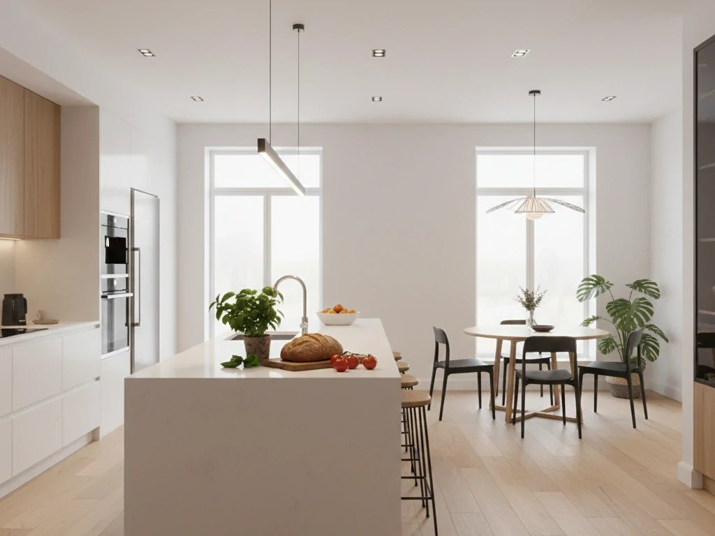
3500K Color Temperature – Balanced and Neutral
3500K color temperature occupies the middle ground between warm and cool. It is often described as neutral white with a slight warmth.
This range is ideal when you want lighting that does not strongly influence color perception in either direction.
Best Uses for 3500K Color Temperature
- Home offices
- Laundry rooms
- Multipurpose spaces
- Retail-style environments
- Workshops inside homes
It provides good visibility while remaining comfortable for extended periods.
Visual Characteristics
- Minimal yellow or blue tint
- Clear and balanced appearance
- Good color rendering
Many professionals use 3500K color temperature when a space serves multiple functions and needs lighting that adapts well to different tasks.
Is There a Big Difference Between 3000K and 3500K?
Yes. While subtle, 3500K appears noticeably more neutral. People often describe 3000K as “warm” and 3500K as “clean.” The difference becomes more obvious when fixtures are placed side by side.
4000K Color Temperature – Crisp, Clean, and Practical
4000K color temperature produces a neutral-to-cool white light. It is significantly less warm than 3000K, yet not as blue as higher Kelvin values.
This range is commonly used in spaces where clarity and visibility matter more than ambiance.
Ideal Applications
- Kitchens
- Bathrooms
- Garages
- Basements
- Utility rooms
- Home gyms
4000K color temperature improves contrast, making edges and details easier to see.
Visual Characteristics
- Bright white appearance
- No yellow tint
- Slightly cool but not clinical
A common question: Is 3000K or 4000K better for outdoor lighting?
For decorative and residential outdoor areas, 3000K often feels more welcoming. For security lighting, pathways, and functional outdoor zones, 4000K color temperature provides better visibility.
5000K and Higher – Daylight Appearance
Light sources above 5000K are typically described as daylight or cool white.
These higher values are not used as frequently in residential spaces, but they serve specific purposes.
Where High Kelvin Light Is Useful
- Workshops
- Mechanical rooms
- Detailed inspection areas
- Commercial task environments
Visual Characteristics
- Bluish-white appearance
- High contrast
- Strong perception of brightness
People often ask: Which is brighter, 2700K or 5000K?
Technically, brightness depends on lumens. However, 5000K light appears brighter because the human eye perceives cooler light as more intense.
Why High Kelvin Is Rarely Used in Living Areas
Extended exposure to very cool light can feel harsh and fatiguing. It can also disrupt evening relaxation and comfort.
Choosing the Right LED Bulb: Light Bulb Color Temperature vs Purpose
Selecting an LED bulb isn’t simply about picking a wattage replacement or choosing the first option that looks “warm” or “cool.” The real difference between a lighting setup that works and one that merely turns on comes down to matching light bulb color temperature to how a space is actually used.
When you choose the right led bulb color temperature, lighting stops being an afterthought and starts actively supporting comfort, visibility, and daily routines.
This section breaks down how professionals approach that decision in practical, purpose-driven ways.
Start With Function, Not Fixture Type
One of the most common mistakes is choosing color temperature based on the fixture style instead of the room’s function.
A pendant light, recessed light, or floor lamp can all use different color temperatures depending on what they’re meant to accomplish.
Ask yourself first:
- Is this space for relaxing?
- Is it for working or focusing?
- Is it for socializing?
- Is it for detailed tasks?
Your answers point directly toward the appropriate light temperature range.
Warm Light for Rest and Comfort
Spaces meant for rest benefit from warm light because it feels softer and less stimulating.
Recommended range:
- 2700K color temperature
- 3000K color temperature
Best suited for:
- Bedrooms
- Living rooms
- Dining areas
- Reading corners
- Family rooms
Warm lighting supports a relaxed atmosphere and reduces visual tension, especially in the evening. Many people find that switching from a neutral bulb to 3000K light color instantly makes a space feel more inviting without sacrificing too much clarity.
If a room feels cozy but slightly dim or yellow, moving from 2700K color temperature to 3000K color temperature often solves the issue.
Neutral Light for Everyday Living
Some spaces need to support multiple activities — relaxing, working, cleaning, and entertaining. This is where neutral light excels.
Recommended range:
- 3500K color temperature
Best suited for:
- Open-plan living areas
- Home offices
- Craft rooms
- Laundry rooms
- Multipurpose spaces
3500K provides a balanced appearance that neither pushes warmth nor coolness too far. It’s especially useful when one room serves different purposes throughout the day.
Professionals frequently choose this range when they want lighting that stays comfortable for long periods without becoming dull or harsh.
Cooler Light for Task-Oriented Areas
Spaces that require accuracy and visual precision benefit from cooler, crisper light.
Recommended range:
- 4000K color temperature
Best suited for:
- Kitchens
- Bathrooms
- Garages
- Workshops
- Home gyms
4000K color temperature enhances contrast, making edges, textures, and small details easier to distinguish. If you’ve ever struggled to see dirt on countertops or fine print under warm lighting, this shift can make a noticeable difference.
Many homeowners use 3000K color temperature for decorative lighting in kitchens while reserving 4000K color temperature for under-cabinet or task lighting.
Outdoor Lighting: Function Comes First
Outdoor lighting has different goals depending on location.
- Patios and porches benefit from 3000K color temperature for ambiance
- Walkways, driveways, and security zones often perform better with 4000K color temperature
If your priority is comfort and curb appeal, warmer tones work well. If your priority is visibility and safety, cooler tones provide clearer definition.
Consider Layered Lighting Instead of One Compromise Bulb
Trying to find one color temperature that does everything usually leads to disappointment.
Professionals design lighting in layers:
- Ambient lighting for general illumination
- Task lighting for work areas
- Accent lighting for atmosphere
Each layer can use a different light bulb color temperature.
Example:
- Living room ceiling lights: 3000K
- Floor lamp near sofa: 2700K
- Desk lamp: 3500K
This approach creates depth, flexibility, and better visual comfort than relying on a single Kelvin value.
Tunable White LEDs: Flexible but Not Automatic
Some modern LEDs allow adjustable color temperature. These systems can shift from warm to cool.
They offer flexibility, but they still require thoughtful setup. Simply sliding to the coolest setting doesn’t guarantee better lighting. The same principles apply:
- Warm for rest
- Neutral for mixed use
- Cool for tasks
Understanding light temperature remains essential, even with adjustable technology.
Match Color Temperature With Room Finishes
Surfaces influence how light temperature is perceived.
- Warm woods and earth tones look best under warmer light
- Gray, white, and modern finishes often benefit from neutral or cooler light
If your space has warm finishes, extremely cool lighting can make it feel sterile. If your space is mostly cool-toned, very warm lighting may look muddy.
Always consider how walls, flooring, and furniture interact with your led bulb color temperature choice.
Avoid the “Too Cool Everywhere” Trap
Some people assume cooler light always equals better visibility and use high Kelvin bulbs throughout the house.
The result:
- Harsh evening lighting
- Reduced comfort
- Spaces that feel clinical
Instead, reserve cooler light where it truly adds value and keep living areas in warmer or neutral ranges.
Simple Decision Guide
- Relaxation spaces → 2700K–3000K
- Mixed-use spaces → 3500K
- Task spaces → 4000K
Use this as a starting point, then fine-tune based on personal preference.
Real-World Tip: Test Before Finalizing
Lighting looks different depending on ceiling height, room size, wall color, and natural light.
Before replacing every bulb:
- Buy one bulb in your target Kelvin range
- Install it in the intended space
- Observe it during day and night
This small step prevents expensive mistakes and ensures your light bulb color temperature truly fits the room.
Key Takeaway
Choosing the right LED bulb is not about chasing the latest trend. It’s about aligning light color temperature with how each space is used.
When light temperature matches purpose, rooms feel more comfortable, tasks become easier, and lighting stops being a frustration.
Once you start selecting led bulb color temperature based on function rather than guesswork, your lighting decisions become simpler, more consistent, and far more successful.
How to Tell If You Need a Lighting Upgrade
Many people assume a lighting upgrade is only necessary when fixtures stop working. In reality, outdated or poorly matched light color temperature is one of the most common hidden problems in homes and workspaces. The lights may turn on, but that doesn’t mean they are working well.
If your space feels uncomfortable, hard to use, or visually unappealing, the issue is often related to light temperature, not just brightness or fixture style.
Below are clear, real-world signs that indicate it may be time to rethink your lighting.
- Your Space Feels Too Harsh or Too Dull
One of the strongest indicators of a lighting problem is emotional response.
- If a room feels cold, sterile, or uncomfortable, your light color temperature may be too high (too cool).
- If a room feels gloomy, heavy, or muddy, your light color temperature may be too low (too warm).
For example, living rooms lit entirely with 4000K color temperature often feel overly clinical. Meanwhile, kitchens lit only with 2700K color temperature can feel dim and murky, even when brightness levels are technically adequate.
When lighting makes you want to leave a room instead of stay in it, that’s a clear sign something needs to change.
- You Struggle to See Details Clearly
If you notice any of the following:
- Reading small print is difficult
- Food prep feels harder than it should
- You miss dirt, crumbs, or stains until very close
Your light bulb color temperature may not be supporting visual clarity.
Warm light softens contrast. While that’s great for relaxation, it can make detail work harder. Switching task areas to 3000K color temperature or 4000K color temperature often produces an immediate improvement without increasing brightness.
This is a classic case where people assume they need “brighter” bulbs, but what they really need is better light temperature.
- Colors Look Wrong or Unflattering
Lighting strongly affects how colors appear.
Signs of trouble include:
- Paint colors looking dull or muddy
- Food appearing gray or lifeless
- Skin tones looking unhealthy in mirrors
These issues are frequently tied to mismatched led bulb color temperature.
Warm lighting enhances reds and yellows but can mute blues and whites. Cooler lighting emphasizes blues and whites but can drain warmth from wood and skin tones.
If colors never look quite right in a space, adjusting light color temperature is often more effective than changing paint or décor.
- Your Eyes Feel Tired Faster Than They Should
Visual fatigue is a subtle but important warning sign.
Poorly matched light temperature can cause:
- Eye strain
- Headaches
- Difficulty focusing
- A constant urge to increase brightness
If your workspace uses very warm light, your eyes may work harder to see details. If it uses very cool light, the glare and contrast can become exhausting.
Neutral ranges such as 3500K color temperature are often more comfortable for long periods of reading or computer work.
When lighting makes you tired, it’s not doing its job.
- One Room Feels Great While Another Feels Awful
If some rooms in your home feel pleasant and others feel uncomfortable, compare their light color temperature.
Often, the better-feeling rooms accidentally landed in a more suitable Kelvin range. Replicating that light temperature elsewhere can dramatically improve consistency and comfort.
This is a strong clue that your lighting issues are about color temperature, not fixture quality.
- You Recently Changed Décor or Paint Colors
Room updates can change how light behaves.
For example:
- Switching to gray or white walls often benefits from 3000K color temperature or 3500K color temperature
- Introducing lots of warm wood tones often pairs better with 2700K color temperature
If you updated finishes but kept the same bulbs, your lighting may no longer match the space.
Lighting should evolve with design changes.
- You’re Using the Same Bulb Type Everywhere
Using one Kelvin value throughout an entire home is rarely ideal.
Bedrooms, kitchens, bathrooms, living rooms, and garages have very different functional needs.
If every room uses identical light bulb color temperature, chances are several spaces are compromised.
A lighting upgrade doesn’t always mean new fixtures. Often, it simply means selecting better led bulb color temperature values for each room.
- You Rely Heavily on Lamps to “Fix” Overhead Lighting
If you constantly turn on table lamps or floor lamps because ceiling lights feel unpleasant, that’s a sign overhead lighting isn’t set to the right color temperature.
Lamps are compensating for a mismatch.
Fixing the ceiling light’s color temperature often reduces the need for extra lamps and creates a more balanced environment.
- Your Outdoor Areas Feel Unwelcoming or Unsafe
Exterior lighting problems are easy to spot:
- Patio feels cold and uninviting
- Walkways feel dim or unclear
- Entry areas look harsh
These are usually color temperature issues.
- Warm tones create comfort
- Cooler tones improve visibility
Adjusting outdoor light temperature can improve both aesthetics and safety without adding more fixtures.
- You’ve Never Thought About Light Color Temperature Before
If lighting choices were always based only on “warm white” or “cool white” labels, there’s a strong chance your setup could be improved.
Modern lighting offers precise control over light color temperature, and taking advantage of it often leads to immediate, noticeable improvements.
Common Misconceptions About Light Color Temperature
Even people who pay close attention to their lighting often carry misunderstandings about light color temperature. These misconceptions lead to poor bulb choices, uncomfortable spaces, and unnecessary frustration.
Clearing up these myths is essential if you want lighting that truly supports how you live and work.
Let’s look at the most common false assumptions — and what actually matters in practice.
Myth 1: Higher Kelvin Means Brighter Light
This is by far the most widespread misconception.
Light color temperature does not measure brightness.
Brightness is measured in lumens. Color temperature only describes the appearance of the light.
A 2700K color temperature bulb and a 4000K color temperature bulb can both produce the same lumen output. The difference is in how the light looks, not how much light is produced.
Why the confusion exists:
Cooler light (higher Kelvin) increases contrast and edge definition. This makes spaces feel brighter, even when lumen output is identical.
Real-world consequence:
People often replace warm bulbs with very cool bulbs trying to get more brightness, then end up with harsh, uncomfortable lighting. The correct solution is usually to increase lumens or improve fixture placement — not jump to a much higher Kelvin value.
Myth 2: Cool Light Is Always Better for Work
While cooler light can enhance contrast, extremely cool light is not automatically better for productivity.
Many people work more comfortably under neutral ranges such as 3500K color temperature or moderate cool ranges like 4000K color temperature.
Very cool lighting can cause:
- Glare
- Eye fatigue
- Headaches
- Reduced long-term comfort
For tasks that require focus, balance matters more than maximum coolness.
The best approach is:
- Neutral light for extended work
- Cooler light only where precision is critical
Myth 3: Warm Light Is Only for Bedrooms
Warm light is excellent for bedrooms, but its usefulness goes far beyond that.
2700K color temperature and 3000K color temperature work well in:
- Living rooms
- Dining rooms
- Hallways
- Entryways
- Lounge areas
Warm light supports relaxation, social interaction, and comfort. Restricting it to sleeping spaces alone removes one of its biggest advantages.
Myth 4: All LEDs Look the Same
Many people assume that LED lighting produces a uniform look.
In reality, led bulb color temperature can vary dramatically — from very warm amber to very cool white.
Two LED bulbs that look similar in packaging can create completely different environments once installed.
In addition to Kelvin value, factors such as color consistency and manufacturing quality affect appearance. This is why checking actual Kelvin ratings and testing bulbs is important.
Myth 5: One Color Temperature Should Be Used Everywhere
Using a single light bulb color temperature throughout an entire home is rarely ideal.
Different rooms serve different purposes:
- Bedrooms prioritize comfort
- Kitchens prioritize clarity
- Living rooms prioritize atmosphere
- Bathrooms balance comfort and visibility
Trying to force one Kelvin value to handle all of these functions almost always leads to compromise.
Professional lighting design embraces multiple color temperatures working together.
Myth 6: 2700K Is Too Yellow for Modern Homes
Some people avoid 2700K color temperature because they associate it with outdated lighting.
In reality, 2700K remains one of the most widely used and appreciated warm light ranges, especially in residential spaces.
What makes 2700K feel “too yellow” is usually:
- Poor fixture design
- Low brightness
- Incorrect placement
When applied correctly, 2700K provides warmth without making spaces look old-fashioned.
Myth 7: 3000K and 3500K Look Almost the Same
While close in number, 3000K color temperature and 3500K color temperature produce noticeably different results.
- 3000K feels warm and soft
- 3500K feels neutral and cleaner
This difference becomes more obvious when lights are viewed side by side or when performing detailed tasks.
Assuming they are interchangeable often leads to disappointment.
Myth 8: Cooler Light Always Looks More Modern
Modern design is about balance, not simply cooler tones.
Many contemporary interiors intentionally use warm or neutral light to create contrast with clean architectural lines and minimalist finishes.
Extremely cool lighting can make even expensive spaces feel industrial or uncomfortable.
Modern lighting design focuses on intentional placement and layered light — not just higher Kelvin numbers.
Myth 9: Changing Color Temperature Fixes Everything
While adjusting light temperature can dramatically improve a space, it cannot compensate for:
- Poor fixture placement
- Insufficient lumen output
- Lack of layered lighting
Color temperature is one part of a larger lighting system.
For best results, consider:
- Color temperature
- Brightness (lumens)
- Distribution
- Layering
All four work together.
Myth 10: You Must Choose Between Warm OR Cool
Lighting does not have to be an either/or decision.
A well-designed space often uses:
- Warm ambient lighting
- Neutral task lighting
- Accent lighting for highlights
This layered approach creates depth, comfort, and flexibility.
Conclusion: Light Temperature Choices That Actually Work
The power of light color temperature goes way beyond reading the Kelvin number on a bulb package. It shapes how we feel, how accurately we see colors, and whether a space feels relaxing or energizing.
Here’s a simple checklist you can take with you:
- Warm (2700K–3000K) = comfort and mood lighting
- Neutral (3500K–4000K) = balanced, everyday use
- Cooler temperatures = task clarity and visibility
Use this guide to evaluate your current lighting, experiment boldly, and tailor your lighting to how you live and work. Once you get it right, you’ll wonder how you ever lived without understanding the impact of light temperature in your space.
Light Color Temperature Questions Answered
What exactly is light color temperature?
Light color temperature describes the visual warmth or coolness of a light source, measured in Kelvin (K). Lower Kelvin numbers produce warmer, yellowish light, while higher numbers create cooler, bluish light.
For example:
• 2700k color temperature = warm, cozy glow
• 3000k light color = slightly whiter warm light
• 3500k color temperature = balanced neutral
• 4000k color temperature = clean, cool white
Light color temperature does not indicate brightness. It strictly refers to the tone of the light, not how intense it is.
Is light temperature the same as brightness?
No. Light temperature describes color appearance. Brightness is measured in lumens.
You can have a very bright warm light or a very dim cool light. Confusing these two leads to many lighting mistakes. Always evaluate lumens for brightness and light color temperature for mood and function.
Which light bulb color temperature is best for homes?
There is no single “best” option. The right light bulb color temperature depends on room function and personal comfort.
Common residential guidelines:
• Living rooms: 2700k color temperature or 3000k color temperature
• Bedrooms: 2700k color temperature
• Kitchens: 3000k light color or 3500k color temperature
• Bathrooms: 3500k color temperature or 4000k color temperature
Most homes use a combination of light temperatures rather than one uniform setting.
What is the difference between 2700k and 3000k color temperature?
2700k color temperature appears warmer and more amber, similar to traditional incandescent bulbs.
3000k color temperature is still warm but slightly whiter and cleaner.
Choose 2700k if you prioritize ambiance and relaxation. Choose 3000k light color if you want warmth with better visual clarity.
Is 4000k color temperature too harsh for residential spaces?
Not necessarily.
4000k color temperature feels crisp and neutral, which works well in:
• Kitchens
• Bathrooms
• Home offices
• Laundry rooms
However, many people find 4000k too cool for bedrooms or living rooms, where warmer tones feel more comfortable.
What light temperature helps with focus and productivity?
Cooler light temperatures stimulate alertness.
Most people perform best under:
• 3500k color temperature
• 4000k color temperature
These ranges provide visual clarity without the clinical feeling of higher Kelvin values.
Does LED bulb color temperature affect sleep?
Yes. Cooler light contains more blue wavelengths, which can suppress melatonin production. Prolonged exposure to cool light in the evening may delay sleep.
For nighttime areas, choose:
• 2700k color temperature
• 3000k color temperature
These warmer tones support the body’s natural wind-down process.
Can I mix different light color temperatures in one home?
Yes—and you should.
Professional lighting plans often use layered temperatures:
• Warm light in relaxation zones
• Neutral or cool light in task areas
Consistency within each room matters more than consistency across the entire house.
Why do two bulbs with the same Kelvin rating look different?
Several factors influence perceived color:
• Color rendering quality
• Phosphor composition
• Diffusers and lenses
• Surrounding surface colors
Even when labeled identically, LED bulb color temperature may vary slightly between manufacturers or production batches.
What is CRI and how does it relate to light color temperature?
CRI (Color Rendering Index) measures how accurately colors appear under a light source.
Light color temperature defines tone.
CRI defines color accuracy.
For residential and commercial interiors, look for CRI 80 or higher. High CRI combined with the right light temperature delivers both pleasant tone and accurate color appearance.
Is higher Kelvin always better for outdoor lighting?
Not always.
• 3000k light color is commonly used for residential exteriors and landscape lighting
• 4000k color temperature works well for security and pathways
Warmer outdoor light reduces glare and blends better with natural surroundings.
How do I know which light bulb color temperature I currently have?
Check the bulb packaging or the printed markings on the bulb base. It will list Kelvin (K).
If unavailable, compare visually:
• Yellowish glow → around 2700k color temperature
• Soft white → around 3000k color temperature
• Bright white → around 3500k color temperature
• Cool white → around 4000k color temperature
Can changing light temperature improve how my room looks?
Absolutely.
Walls, furniture, and finishes reflect light differently depending on light color temperature. A room that feels dull under cool light may feel richer under warm light—and vice versa.
Lighting upgrades often deliver larger visual improvements than repainting or replacing furniture.
Should I choose tunable white lighting?
If budget allows, tunable white systems offer flexibility. You can adjust between warm and cool light temperature throughout the day, matching circadian rhythms and changing tasks.
For most homes, however, selecting well-matched fixed temperatures room-by-room is more than sufficient.
Does higher light temperature save energy?
No. Energy consumption depends on wattage and efficiency, not Kelvin rating.
A 3000k color temperature bulb and a 4000k color temperature bulb with the same wattage use the same amount of energy.
What is the most versatile light color temperature?
If you must choose one:
• 3000k light color is the most versatile compromise between warmth and clarity.
It works well in living spaces, bedrooms, kitchens, and hallways without feeling too yellow or too blue.
Can light color temperature influence mood?
Yes.
• Warm light promotes relaxation and comfort
• Neutral light supports balance
• Cool light encourages alertness
This is why professional designers treat light temperature as a psychological tool, not just a technical specification.
When should I consider professional lighting advice?
Consider professional input if:
• You are renovating multiple rooms
• You experience eye strain or discomfort
• Lighting feels inconsistent or patchy
• You want layered lighting strategies
Expert planning ensures light color temperature, brightness, and distribution work together.